I can say, beyond a shadow of a doubt, that my outlook on life is directly tied to the amount of time I spend outdoors working or playing or just relaxing in my yard. I used to think it was time in the sunshine that made me feel better — Vitamin D, you know — but the sunshine has been missing the last few days and, after being outside, I still feel more alert mentally and much stronger physically than I have all winter long.
As we’ve talked before (see September 2017 blog series), researchers now know the benefits of spending time in nature. Just a few minutes a day have been proven to lower blood pressure, boost the immune system, reduce stress, improve mood and increase self-esteem.Time in nature is so beneficial that physicians are beginning to prescribe time outdoors instead of pills as part of the healing process. An added perk is that the time in nature doesn’t have to be a complicated process of traveling to a special destination for a designated time frame. Simply walking out the door and spending time in your own green space is therapeutic.

When this came up in a conversation I was having with a group of friends the other night, I got some unexpected push-back. A couple of people just shook their heads and said that time in their yards was not enjoyable AT ALL. The only time they spent in the yard was taking out the trash. After a little bit of pressing, one admitted that all she had to look at was a patch of “weed infested grass” and a “sorry tree.”. Another confessed that she faithfully planted her flower beds every summer and every summer she was totally disappointed in their outcomes.
Their responses got me thinking. To me, creating a personal retreat in my yard is not a complex or overwhelming task. It does seem to be almost insurmountable to others. The reality is that something as simple as inviting colors you love into your surroundings can be the beginning of establishing a unique space in which you take true joy. With a little help, anyone can be successful. Our next few blogs can be that help for you!

A professional in using color in design, Sandy DeFoe, Embassy’s Art Director, shares with us her insights about color and the garden. According to Sandy, a garden is all about color. Color is all around us and there is nothing in the garden that does not have color. It’s obvious that flowers, grass, trees and shrubs provide color in the landscape, but so does the house, the hardscape, the play equipment or any of the other elements that are present. As we’ll discuss next time, those colors need to be considered as part of the whole picture too.

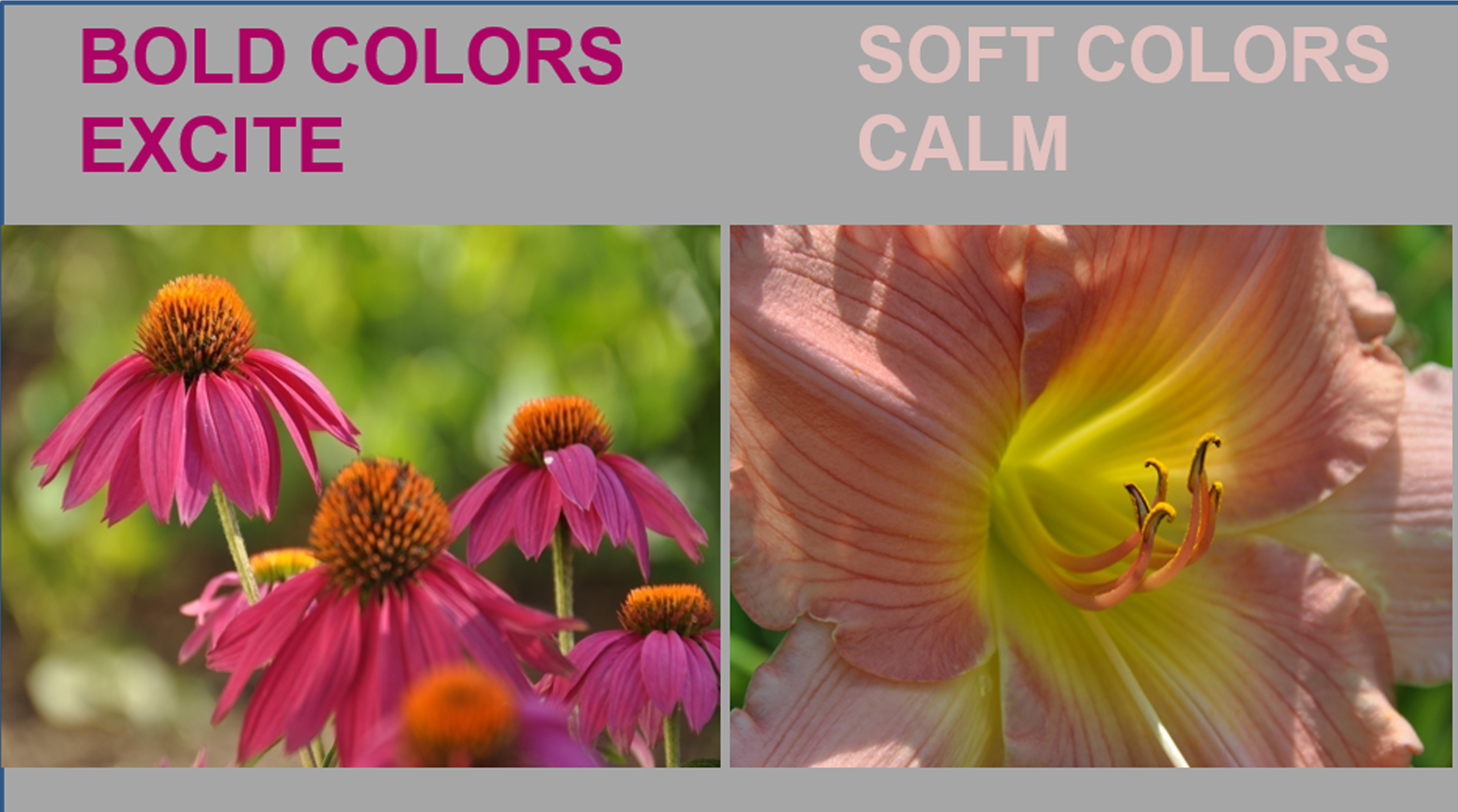
When designing your garden, it is important to first decide what your goals for the space are and then to choose colors that you love that will match your goals. Will your garden be used as a quiet, reflective spot in the early mornings or a gathering place for friends and family in the evenings? Will it be a relaxing space or an exuberant one? Is attracting birds or butterflies important to you? Color, used in the right way in the garden, helps you to realize your dreams.
Colors that harmonize, whether they are pastel or bold, serene or lively, create a pleasing mood. On the other hand, colors that clash can be disquieting and create uninviting spaces. In order to make colors work well in the garden, it’s helpful to understand and use the basic principles of color theory.
Colors have relationships that are easily illustrated using a color wheel. As the name implies, a color wheel is a circle that gives a visual representation of the relationship of colors. Developed in 1666 by Sir Isaac Newton, even today it is an excellent tool for finding harmony among colors.

Isaac Newton
One way to appealingly combine colors is by using adjacent or analogous colors. Analogous colors are next to each other on the color wheel. For example, red, orange and yellow are analogous colors as are yellow, green and blue. Because analogous colors blend so well, contrast can sometimes be difficult to achieve and the result can be bland and boring rather than captivating. (The brain tends to ignore or reject information that does not stimulate.) In garden planning, choosing one of the analogous colors to be predominant (usually the middle color on the color wheel) and allowing the others to be subordinate helps to create a peaceful, quiet setting that still intrigues the viewer.

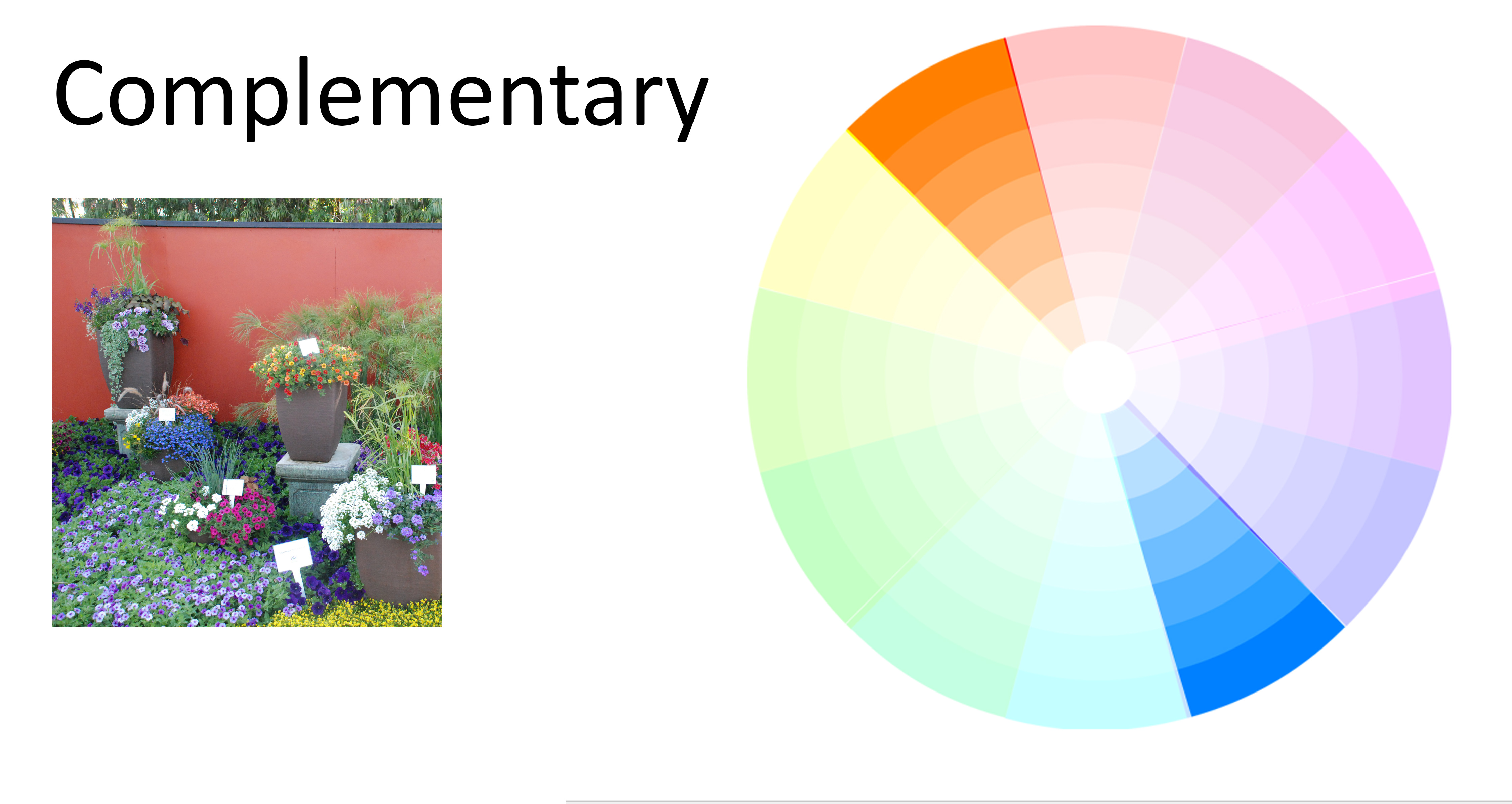
If your garden goal is to have a vibrant, stimulating and exciting space, then select blooms with complementary colors to fill your beds. Complementary colors are directly opposite of each other on the color wheel. Red and green, blue and orange, purple and yellow are all pairs of complementary colors. Placing complementary colors next to each other, causes each color to appear more intense and visually exciting. This is why a pot of bright red geraniums with dark green leaves tends to catch your attention, even at a distance. The brain is responding to the stimulation. However, just as the brain rejects under-stimulation, it also rejects over-stimulation. It’s important to avoid a disconcerting and chaotic effect in the garden. Planting in masses instead of small, random patches of color give a sense of unity to the garden plan.
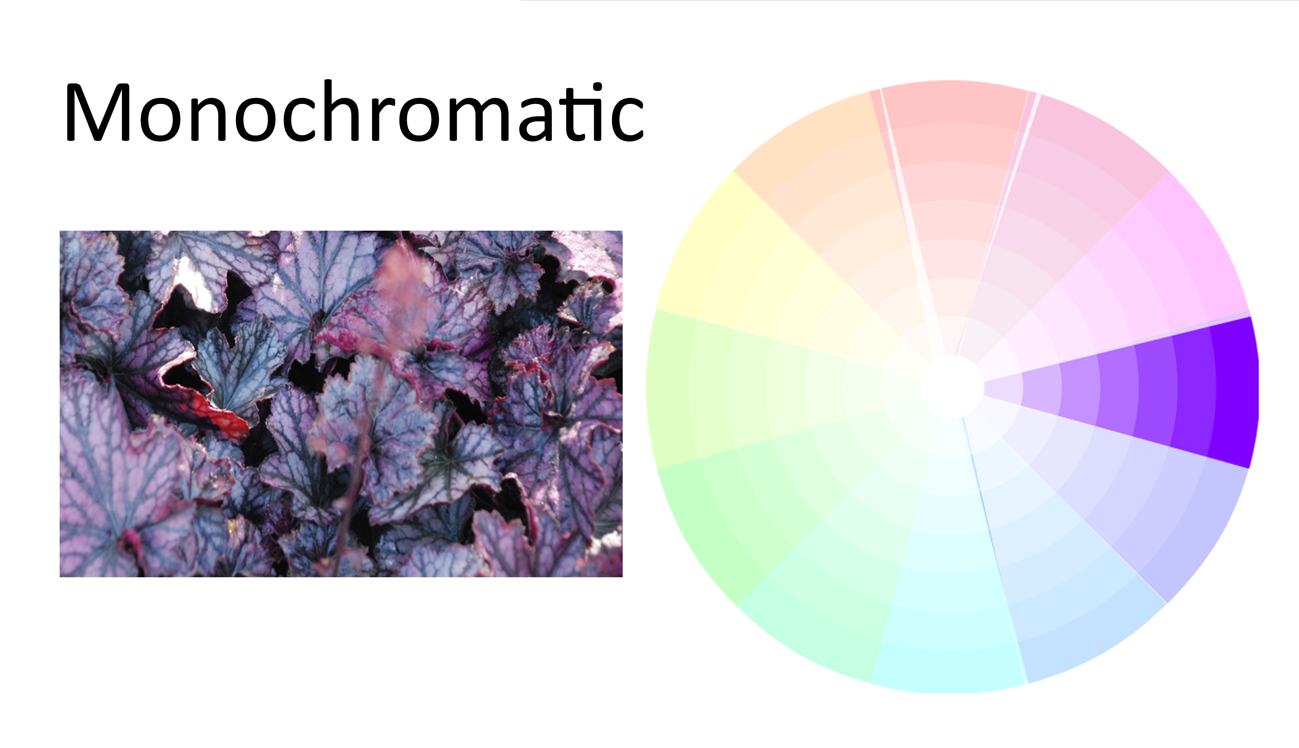
A third common color scheme seen in the garden is a monochromatic theme. Monochromatic gardens focus on just one color. Because there is only one color, these gardens direct the eye to the form and texture of the foliage as well as the blooms. If your garden is primarily viewed in the evenings, think about using an all white garden. It will absolutely shimmer in the soft light of dusk.
Less common but no less beautiful, is the triadic color scheme. Using three colors that are evenly spaced on the color wheel, such as the three primary colors of red, blue and yellow or the secondary colors of violet, orange and green,.results in a dynamic bed that stimulates the senses. As in other designs, having one color dominate helps establish and maintain a sense of balance.

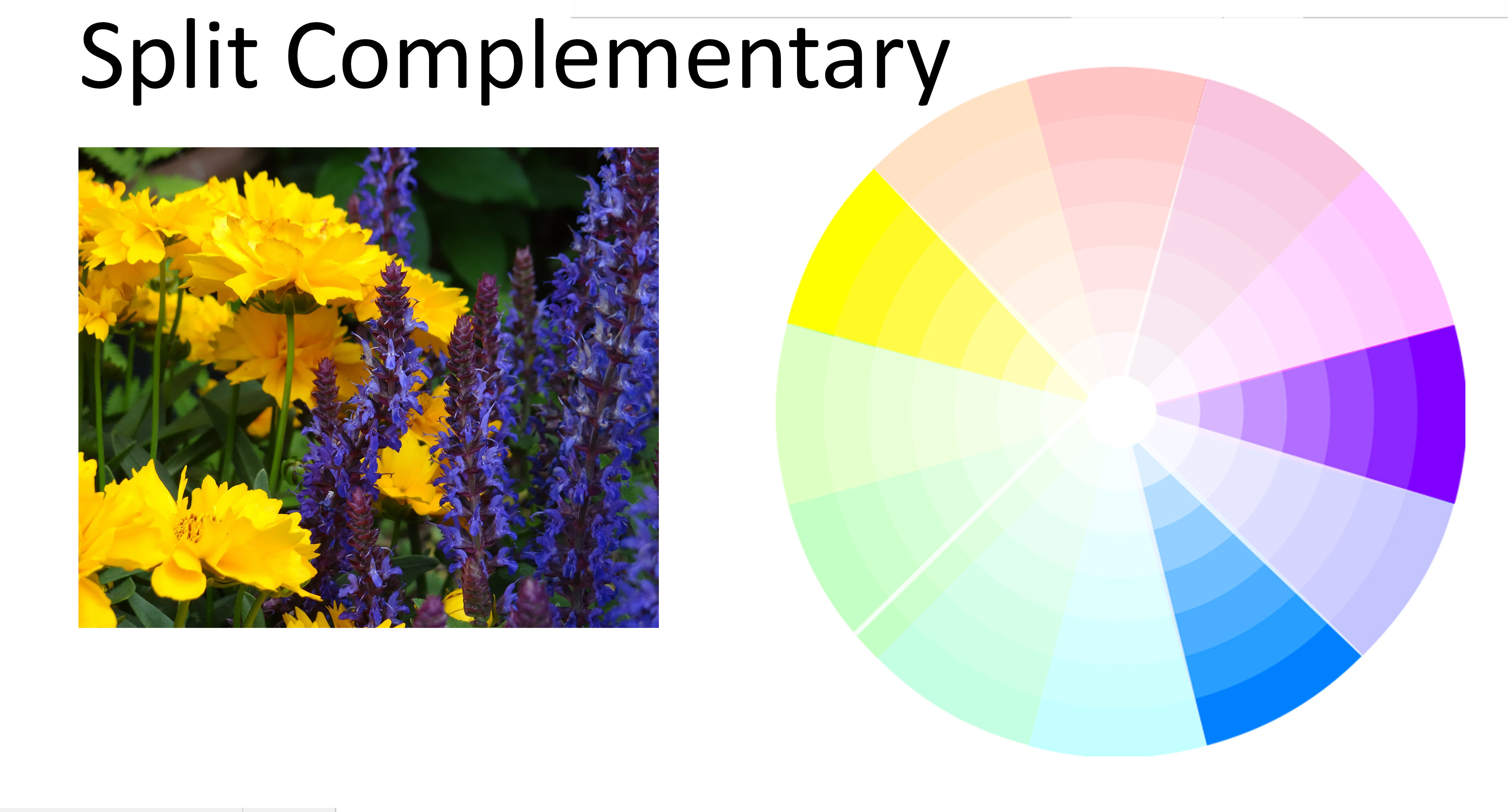
Finally, if used with care, the split complementary theme gives a sophisticated feel to the garden. To use the split complementary, choose a single color as the foundation or the base of the scheme. Using the color wheel, find its complement. The colors on either side of the complementary color are actually the ones used in the design. A split complementary gives the high contrast from complementary colors while also using the soft contrast of analogous ones.
As Sandy said, gardens are all about color. Color theory gives us paths to follow as we design our gardens, but we are certainly free to venture off the path on our own. The colors you choose for your gardens should be the ones that you love and the ones that will entice you to spend time outdoors.
Join us later in the week as we continue our exploration of color in the garden. See you then!
